 it seems a long time since i posted any work but i am now back on track, i hope; the sun is /was shining, it is now 8 in the evening and dark but spring is round the corner. i have had enough of this wish to hibernate. i started by looking closely at areas of my shi sha textiles and made various items for rubbing and printing from. lino cuts, large scale shi sha from chocolate coin foils,large scale kutch and chain stitches and in keeping with my graffiti theme some more stencils.
 one- basic rubbing with caran d'ache metallic wax crayons on black tissue
 two- again using a mixture of items for rubbing over with Markal sticks, wax crayons and adding a bit of colour with oil pastels on tissue
 three- on silk 'paper' a similar use of rubbings
 four- on a Japanese ribbed paper
 five- more rubbings but i wanted to explore cut outs on the paper like Jali screens, would like to do more cut outs all over.
 six- same sort of thing to five but with cut outs from one of the stencils i made, on Lokta paper
 seven- now to printing with the lino cuts using metallic paints and layering with rubbings
 eight- more combinations of print and rub (sounds like scratch and sniff)!
 working one lino print into a round to imitate a shi sha with rubbed wavy ric rac lines. like Indian textiles i wanted to explore the use of a patterned substrate. the local Indian deli gave me the newspaper which i coloured with 'brusho'
 nine- using the concept of layering i tried some rubbings onto acetate with mainly oil pastels.
 ten- starting to get carried away with glitter, i stencilled areas with pva and applied glitter. i keep thinking they look like wrist watches!
 eleven- more glitter
 oops forgot to number the above! anyway i pleated and printed onto a pre-rubbed silk paper, opened out and added more print in different colour way and applied some bits of newsprint.
 again forgot to number - pleated and stencilled with metallic paint then various rubbings and then pleated in a different direction and stuck stencilled circles of tissue over the pleats. when dry i tore the pleats open and added markal silver ric-rac.
 twelve- printing with collage onto a silver shiny paper which has curled up a bit on drying but it gives an interesting effect.
 finally a collage of various bits and bobs.i also did some printing with glitter onto the shiny silver paper but i found it rather difficult to photograph, i will try again, but i am now ready to do some stitching for Chapter 7!
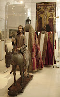 Whilst i was in london last week i visited my old work place,the V&A! my intention was to see, at last, the new Medieval and Renaissance galleries which i must say are looking rather splendid and these photos don't do them justice (i blame the camera!)
 it was such a pity that they weren't open when i did my Opus Anglicanum study and that it took a funeral for the opportunity to see them. if anyone is working on their Opus study i highly recommend a visit to give you some idea of the pieces 'in the flesh', albeit behind glass and some unfortunately at the back of the cases when they would have benefited from being much closer to the viewer (John of Thanet being one).There are some stunning pieces and the one you can get closest too is amazingly intricate.it was also a very pleasant surprise to see displayed the small burse panel depicting St.George slaying the dragon and St.Catherine which i had conserved some eight years ago (oh dear cat out of bag!).
 I swore I would never use this blog for personal information but somehow it seems wrong not to on this occassion. My brother died recently and much too young. He will be sadly missed by me and many other people. TRIBUTE
 at last i think I've done it! it seems so long ago that i started this study. it was before Christmas i did some of these drawings. see my previous post for photos of the actual textile. in the end i studied 4 pieces, a small box i have been trying to get rid of for ages!,one i borrowed from a friend,another a small Christmas tree decoration i bought from Chadni Chowk and a woman's tunic (chola)i studied at the museum in Exeter and for copyright reasons i have no photos of this.i realised that i haven't labelled these pictures but i think they are fairly self explanatory.
 the piece i borrowed was a bit of a patchwork and i was not able to see the reverse.some of the threads were quite flourescent so i used gel pens.
 above a drawing from my box, worked in metallic threads.
 next one above is the Christmas decoration, the reason i bought it was the fact it had lettering on the mirror, which appealed to my sense of the offbeat!
 above drawing from the Chola which had added sequins.
 i then did some extension drawings, mainly using chalks (oil and chalk)
 above pink was brusho and bleach.
 oil pastels on yellow tissue.
 then i did quite a few using brusho, bleach and oil pastels. it took me quite a while to get into the extended drawings but i am really pleased with the above one and the following.


 i did some on a hand made paper which was brushoed and then stamped with an Indian stamp in bleach and then drawn on top.
 finally the stitched study! i noticed in my study how many Indian textiles are embroidered on a patterned fabric that bears no relationship whatsoever to the embroidered design, so i worked my stitches onto patterned paper. the other thing that evokes Indian textiles are the many varied colours, so i chose colours i had observed in my studies. the idea of the patchwork was from the first textile.
 chain stitch
 buttonhole stitch and couching on a poppadom wrapper
 Kutch stitch which appears everywhere and in many shapes and patterns all based on a grid of threads.
 the last stitch is a combination of Kutch and two types of herringbone with a back stitch at the base. half way through my study i was having difficulty finding the stitch techniques i wanted so i ordered Anne Morrell's 'The Technique of Indian Embroidery' book through the library. Who would have thought that Budleigh Salterton would come up trumps on inter library loan. Budleigh pops up everywhere, even in Noel Cowards 'Blythe Spirit'!!!
As an aside i have just been to see 'Paper Works' an exhibition of art made from paper at The Devon Guild of Craftsmen, wonderfully inspiring. tomorrow i am hopefully going to Bristol to see 'Celebrating Paper' at the Royal West of England Academy and hopefully pop into Colston Hall in en route to see Matthew Harris' walls!! Oh and i can thoroughly recommend the Chris Ofili at Tate Britain, WOW i want some polyester resin to play with.

 it seems a long time since i posted any work but i am now back on track, i hope; the sun is /was shining, it is now 8 in the evening and dark but spring is round the corner. i have had enough of this wish to hibernate. i started by looking closely at areas of my shi sha textiles and made various items for rubbing and printing from. lino cuts, large scale shi sha from chocolate coin foils,large scale kutch and chain stitches and in keeping with my graffiti theme some more stencils.
 one- basic rubbing with caran d'ache metallic wax crayons on black tissue
 two- again using a mixture of items for rubbing over with Markal sticks, wax crayons and adding a bit of colour with oil pastels on tissue
 three- on silk 'paper' a similar use of rubbings
 four- on a Japanese ribbed paper
 five- more rubbings but i wanted to explore cut outs on the paper like Jali screens, would like to do more cut outs all over.
 six- same sort of thing to five but with cut outs from one of the stencils i made, on Lokta paper
 seven- now to printing with the lino cuts using metallic paints and layering with rubbings
 eight- more combinations of print and rub (sounds like scratch and sniff)!
 working one lino print into a round to imitate a shi sha with rubbed wavy ric rac lines. like Indian textiles i wanted to explore the use of a patterned substrate. the local Indian deli gave me the newspaper which i coloured with 'brusho'
 nine- using the concept of layering i tried some rubbings onto acetate with mainly oil pastels.
 ten- starting to get carried away with glitter, i stencilled areas with pva and applied glitter. i keep thinking they look like wrist watches!
 eleven- more glitter
 oops forgot to number the above! anyway i pleated and printed onto a pre-rubbed silk paper, opened out and added more print in different colour way and applied some bits of newsprint.
 again forgot to number - pleated and stencilled with metallic paint then various rubbings and then pleated in a different direction and stuck stencilled circles of tissue over the pleats. when dry i tore the pleats open and added markal silver ric-rac.
 twelve- printing with collage onto a silver shiny paper which has curled up a bit on drying but it gives an interesting effect.
 finally a collage of various bits and bobs.i also did some printing with glitter onto the shiny silver paper but i found it rather difficult to photograph, i will try again, but i am now ready to do some stitching for Chapter 7!


