Wednesday, 31 August 2011

Chapter 9Section B

Section B colour and shape: Exercise 1. i chose for my shape (something that has an interesting silhouette) an 'R' and made 2 stencils of differing sizes. i then cut out numerous 'R's' and arranged them in various ways on my coloured papers from the previous exercise.
they are all fairly self explanatory, here grouped together
above randomly sprinkled
opposites
i used the stencil and cut some voids and arranged various cut 'R's' on top
more arrangement and ways of linking shapes
above 2 'R's' slotted together to make a group of 8's
Exercise 2. i used the negative piece i cut from my stencil to make some overlapping shapes with chalk pastels and my fingers
then above using various cut 'R's' offset
then more above
to which i coloured the voids in with the stencil and then below added more cut shapes.
it was at this point i discovered i had missed Bristol's Graffiti festival! but hopefully the work will still be on the wall when we go next. i am now folding paper for the rest of Chapter 9 so more to follow.

Sunday, 28 August 2011

Chapter 9 a long time coming Section A

Chapter 9 is a design exercise with the aim to explore ways of using colour. two contrasting colours were chosen, i made a conscious decision to avoid green! so i chose a Lemon yellow and Deep violet. the aim was to paint one section of paper with each 'neat' and then mix the two equally for the colour in the middle and then work with this mixed colour adding a bit each time to the originals to create a tonal range. i loved the brown colours that were created even though i don't particularly like brown! i used the paints straight out of the tube and used a decorating brush so there are some interesting striations in the paint samples.
next was to make interesting combinations using the painted pieces. somehow i seem to have created some 1950's designs made all the more interesting because of my wood panelling effect!


Exercise 2 these were then added to different backgrounds created with the same colours. i kept the painterly quality of the brush strokes and did in fact dilute the paint this time.
having said i was avoiding green i seem to have achieved it slightly with the use of the lemon yellow over the violet!

#2 Exercise 3 using the same choice of colours and with the addition of white i created a gradual tonal effect from yellow to pale yellow. strips from other tonal pieces were then added. the middle one was cut from a strip using yellow and payne's grey.
#3 the same exercise but using an added tonal strip of violet and payne's grey. More of chapter 9 to follow

Sunday, 21 August 2011

sketchbook Day 30

for this final piece using stitch i went back to my feather but this time grouped a few together. for the first piece i used a fineish thread as i thought feathers were a bit spidery. on the left page i had coloured it with some left over acrylic paint from my latest chapter 'in my real work'! i closed the book for an imprint. the watercolour didn't take too well to the acrylic and i could work into it further (at some point!)
this next one doesn't have any stitching but i noticed the paint had come through the needle holes which added something interesting. i thought the thread i had chosen was natural but it didn't take the paint so well
for the final piece i used a thicker thread which worked beautifully. i also drew the feathers very freely and of course shut the book to get the impression on the left page.
Looking forward to see what Sian has in mind for September! but meanwhile back to my Module.

Sunday, 14 August 2011

nearing the end!

yesterday and this morning i have been working on mono printing. i chose firstly to use some ceramics i have and the first 2 were quite clear. i found that i got a better impression when the paint was near to drying, although the paper i was using tended to stick and if not careful would tear.
i started working with the koh i nor paints to enhance (i hope) the image.
i also went off track with some Warhol printing and splodges
so back on track! above mono print with added colour on top and quite a bit of the background visible. the technique of getting the paint on the glass needs to be worked on but i think printmaking inks definitely work best. i used acrylic paints.
then i did some in my actual sketchbook which has quite thick paper (above) with added washes.
i then used a combination of mono printing and Warhol and wash for the above.
i then went on to draw some empty bottles, i like the way you can see through them, although some had labels. above a direct impression from the plate with scraped off lines added wash and splodges.
more above using the residue on the plate
and finally 2 mono prints on top of each other with added wash. can't wait to see what is in store for us tomorrow!

Saturday, 13 August 2011

sketchbook days 25 - 27

just catching up with a few days. above perspective drawing of a bag.
next i chose to look at a stack of boxes and above using 'carbon copies'
and using heavy carbon with a rubber and the image below using the graphite as a carbon paper but i will work into this.

hope you don't mind Sian but i woke up this morning thinking 'Andy Warhol blotted lines' and remembered Alistair Sooke being shown how to do them. Basically you draw a line on non-absorbent paper/ card and then blot it off onto another piece. i was a bit heavy handed with the above but i used a cocktail stick dipped in Quink and quite pleased with the result. i added an offset image with a lighter wash. there is a video on the BBC website of this technique. in a way i am quite pleased this will only continue for 30 days as coursework is suffering! but once a week would be good.

Sunday, 7 August 2011

sketchbook days 18-22 all in one!

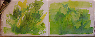
well the weekend came and my guys went off to Edinburgh for 2 weeks so i have the kitchen table to myself, so i made a start with catching up on the sketchbook. i went round the garden and realised that some of the best areas to work with were not easy for sitting in front of and then it rained so i thought i would look out the window to the herb box. above using chalk pastels after scratching into the paper, they are water soluble so i wet areas of the right one and then closed the book, hence the mirror image.
then wet using the koh i nor dyes which i notice are really vibrant when wet but dry slightly powdery in feel unless its my paper.
i added some aqua wax to the right hand page above and reworked with water colours, something suitably dark as it has been on and off today.
above again using koh i nor but using aqua wax on the page before (right) and closing the book (left) Can we do mono printing please Sian?
then to scraffito and i remembered when a child layering up wax crayons with black over the top so above left 'omage to childhood' i have worked here with Markal paint sticks for the base and painted Stewart Gill fabric paints over the top. still slightly sticky!
and lastly using wax candle under the top section, Markal on the bottom and Stewart gill again over. at the end of all this i realised i was looking at fennel too but baby stuff.

Monday, 1 August 2011

Sketchbook days 14,15, 16 and an extra

i went back to my feather for heavy water soluble crayons with some water soluble chalk added above. i have run out of printer ink so have not been able to print out the larger pieces to colour in.
Scribble day above using fine felt tip pens
ripping and sticking! i liked doing this one
then i added an extra using koh i nor, still trying to do highlights and using the edge of a piece of card for the feather lines. i am rather busy at work at the moment so by the time i come home the garden is not really an option. i will store these up for the weekend when hopefully the weather will be better?